Monday, 25 November 2013

Modernism

The modernism era was hugely successful at it's peak, so much so that it was described as ephemeral and metamorphic by the classical French poet Charles Boudelaire. He explained;
"Modernity is the transient, the fleeting, the contingent; it is one half of art, the other being the eternal and the immovable."- (Baudelaire, C., 1863, "The Painter of Modern Life")
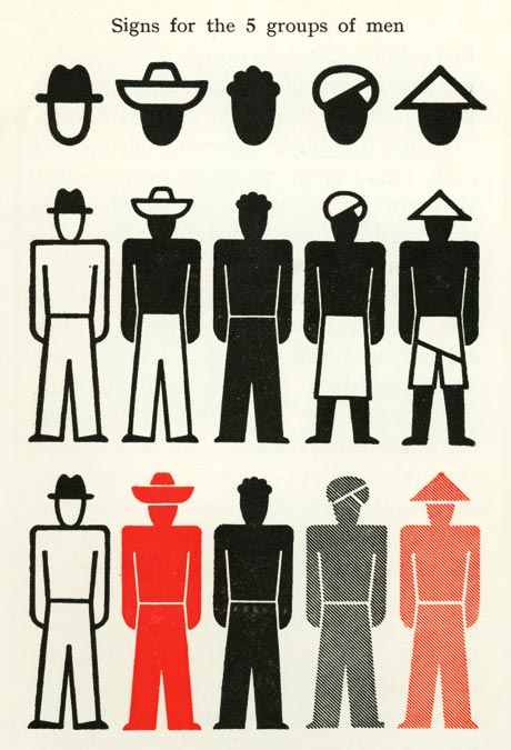
Since then, obviously the movement is no longer ephemeral or "current" but is cemented in the history of design, leaving a legacy of new beginnings, new technology, new ways of working and thinking and a big inspiration for the current designers of today. A big step forward and development within the modernist movement was the development of typography. Previously, the only real 'unusual' type was used in scriptures such as holy books, classic novels etc. Now, however, this breed of designers aimed to set the bar higher with typography and create their own unique brand of ways of expression through words.

Example of Neurath's isotype
Otto Neurath devised the system of 'isotype', now considered to be the beginnings of information design, an international picture language to satisfy his own views (classically saying that "words divide, pictures unite")
with the following intentions;

  •  form over content
  •  authorship
  •  grand narrative
  •  originality, authenticity and expression
  •  individual, single producer
  •  integrity, autonomy of artwork

The use of symbols as type rather than the universal "characters" system was groundbreaking and was eventually rooted in cultural, artistic and political movements at the end of the 19th century and beginning of the 20th century.

This leads on to the recognition of universal symbols. For example, most famous brands have an image, "symbol", that makes them instantly recognizable to the audience across the whole world. Most prominent uses that spring to mind are the Nike "swoosh" and the McDonald's yellow arching "M". Wherever you go in the world, these icons are used for the same purposes. Obviously, you know that if you see the prominent McDonald's logo that there is food available. This is what Otto Neurath wanted to create with his invention of isotype.

Many people within the design industry, once isotype had officially arrived, dismissed previous, "classical" uses of typography. Most notably Max Miedlinger exclaimed that the simple helvetica font was the "scent of the city", meaning it was everywhere you go and how just because it's there to use simply, doesn't mean you have to, especially now that the world was becoming a 'global village' with much more developed communication and later the creation of the computer and furthermore internet.

The Bauhaus

"A house is a machine for living in" - (Jeanneret, C-E., 1923).
"The details are not the details. They make the design." - (Eames, R. & C.)  
From the first few seconds of watching a clip of Charlie Chaplin in the classic silent movie "Modern Times" it was clear that some sort of "modernisation" or "development" in the art fields would be discussed. Modernism emphasises the connection between industry and man, the use of sequences, cogs and wheels mirroring the motion of life alongside the artwork produced by the human being and was originally used as a hopeful tactic to stir up freedom of a newer and more advanced lifestyle and generation.

What immediately comes to mind is The Bauhaus, the world-famous, groundbreaking minimalist German school. Their focus on minimalism was the heart of their school and teaching traditions and has influenced almost all ways of teaching we see today in the education systems around the world. The interesting
Bauhaus curriculum
approach of the Bauhaus was their rather "unconventional" modes of teaching their students. For example, their emphasis on "unlearning" where students were trained to forget all that they thought they knew about the way they drew, created and designed pieces and almost start from scratch with a fresh and open-minded strategy. Does this create connections with the manifesto of the Futurists who cast aside all reference of the designers and techniques that came before them to create a new era within art? I believe it does and shows that although the Futurists claim to be "innovative" and brand-new with the way they work, it isn't all too dissimilar to the methods of the Bauhaus in the way that they treat the use of past, present and future within their manifesto.

The Bauhaus was an extremely male-dominated school with females being "set" into certain pathways of choice within the school, mostly only being able to study the creation of textiles which was the only "feminine" discipline on offer amongst the much more masculine areas of wood, clay and stone (see curriculum diagram). It wasn't only the students who were segregated into certain choices or paths of art and design but also much higher up within the establishment. The masters of The Bauhaus were also all men except for only one female "master", Gunta Stolzl, alongside the now-renowned male masters such as Johannes Itten, Josef Albers and Kandinsky. Their teaching strategies were unconventional to say the least, with Itten insisting that all of his students start their "working day" with dance, exercise and physical expression in a bid to get them as creative as they could be.
One of Bayer's designs (1924)

One of my favourite masters from The Bauhaus has to be Herbert Bayer and his Newspaper Stand designs (1924) really stood out to me. The almost futuristic designs depicting a 'new age' of what was a monotonous and 'boring' everyday item such a regular newspaper stand were groundbreaking in their day and probably were something that had never been seen before, incorporating (as always with the Bauhaus manifesto) functionality with design. This again leads me to consider the Futurist manifesto of "discarding the old" of art and design and creating a brand new movement. Surely, this was Bayer's intention with his designs many years ago? What he had done had never been seen before and was aimed to create a new, "functional yet attractive" everyday way of life. Surely this is mirroring the motto of the Futurist movement?

Monday, 14 October 2013

Introduction.

Over the course of the next several weeks I shall use this blog as a response to lectures that I have attended which individually highlight and explain certain areas/movements of the design world.

Each lecture will showcase the basic beginnings of each movement/group, their manifestos and what they aimed to achieve through their art and give some examples of the work they produced. It is my responsibility therefore to be able to find connections and contextualise my findings of each lecture and argue for/against each movement.

I hope to, by the end of the lectures when all of the blogs are complete, have a better understanding not only of certain movements which I had perhaps not previously looked into but also have a better knowledge of deciphering the intentions of each and having the knowledge and confidence to recognise and form an educated opinion on each of them.